The Hunt – Creating the mood of a poetic tale
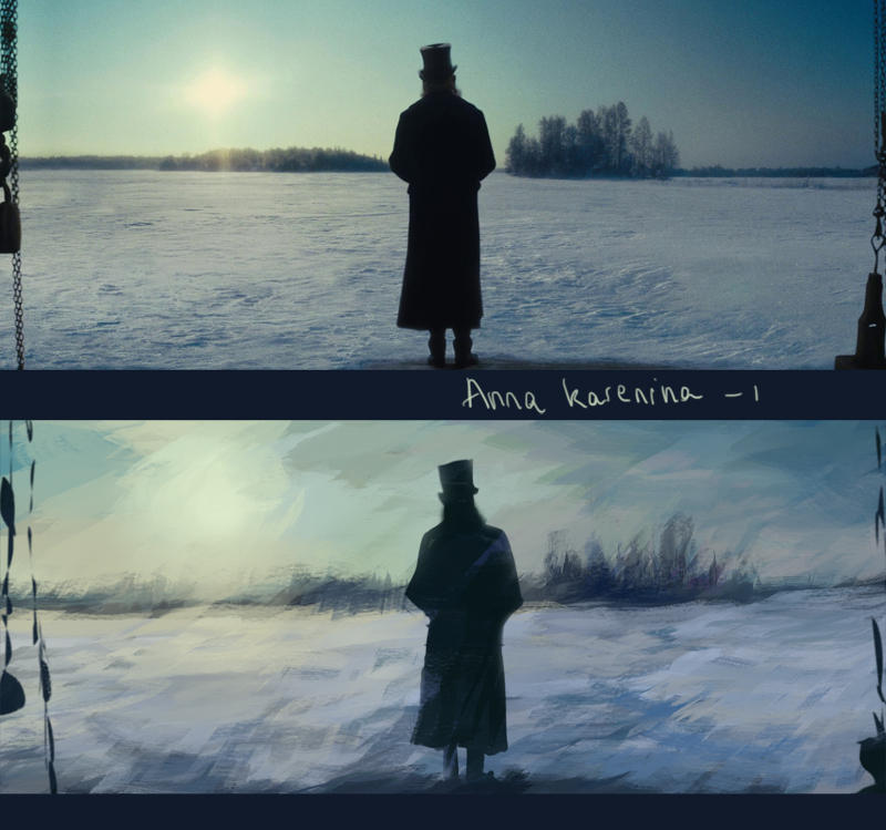
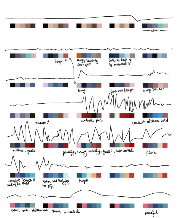
I am really sensitive to colour in relation to storytelling. It is a powerful tool that enhances emotions and abstracts the image, making it more about feelings than logic. Looking at 2D animation backgrounds and colour scripts as well as the use of colour in early Technicolour films influenced me in the early stages of design, to define the colour script, and later helped me at the texturing, matte painting and lighting stages.
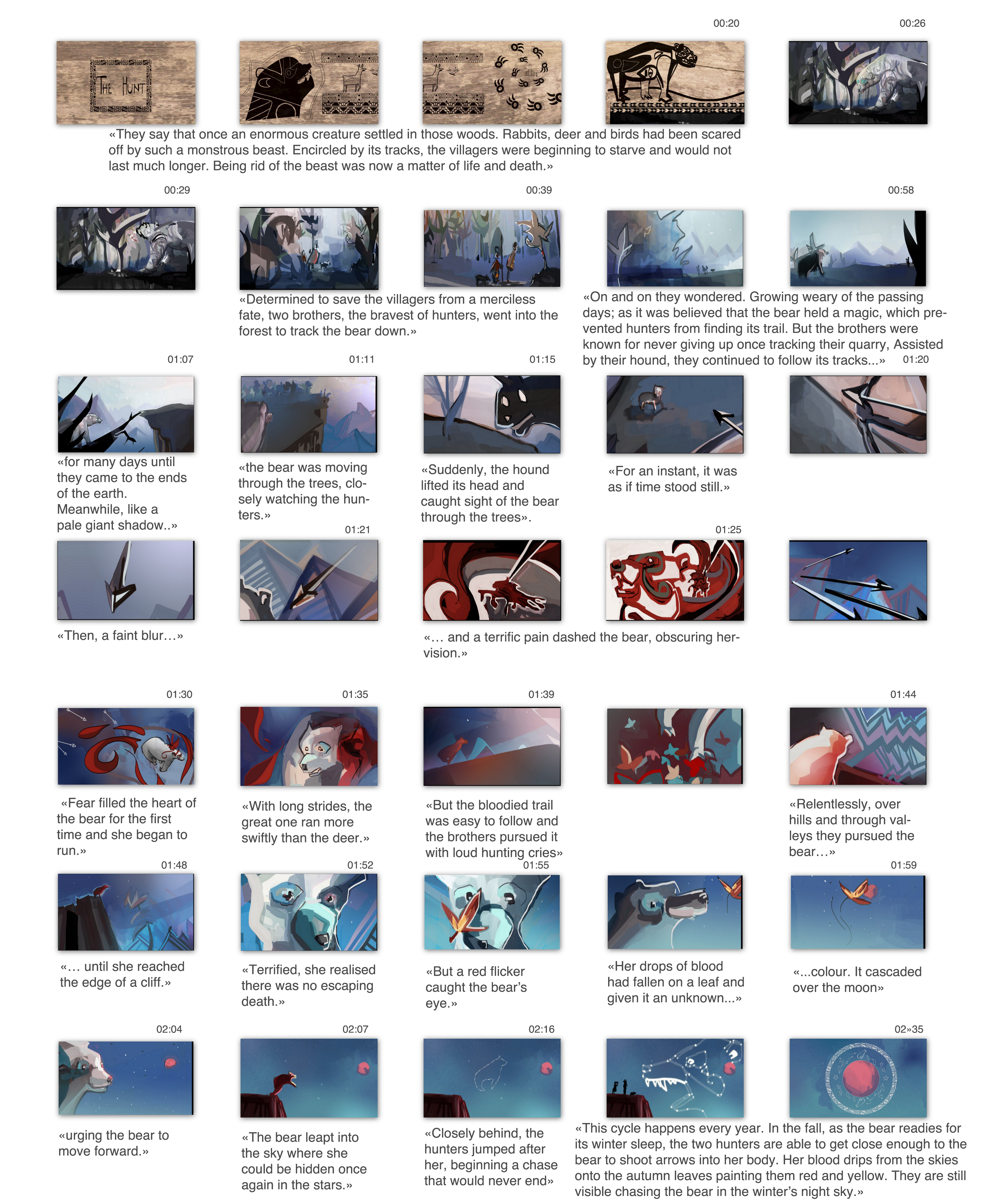
A tale does not have to make perfect sense, it happen in its own world that contains a set of rules different from a more realistic story. But these rules have to be clearly established since the start for the audience to accept them. At the end of our story, two ‘magical’ things happen: the bear creates the autumn colours on the leaves and jumps into the sky, to be turned into stars. To maintain the suspension of disbelief, we have to make the audience accept the world of the tale.
It is therefore important to abstract the image slightly, to play with lines and colours more than in a realistic story. The image has to be expressive, borrowing from impressionism and surrealism rather than realism.
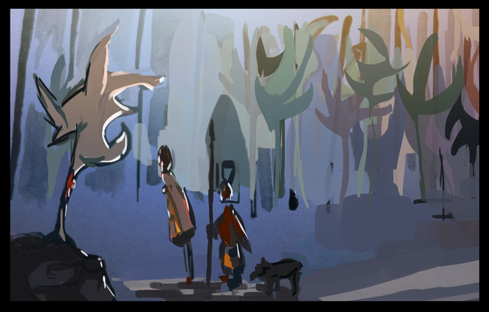
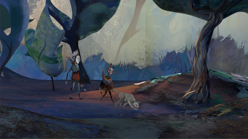
With this in mind, I designed the colourscript to reflect the emotions of the bear rather than the realistic colours the world would have.
The story can be divided into 3 acts, each with its distinct style.
| MOOD | LINES | COLOURS | |
| I. | Peaceful, safe | Parallel lines, curves | Subtle variations, foggy, blue and orange atmospheric light |
| II. | Pain, Panic | Diagonal, sharp lines, abstracted image, geometric | Contrast, red, flatter colours |
| III. | Magical, beautiful | Curves | Rich blue night sky and stars occupy the most space |
They are designed to contrast with each other, starting with the bear living safely in the forest, to the harsh world of the mountains and the encounter with the humans; and finally to finding another world where the bear truly belongs, a world of magic and spirits. To emphasize the importance of certain colours, red is only introduced in the second part, showing the pain and surprise of the bear.
In addition to these 3 styles, there is another distinct style used for the opening and final sequences. We open the animation with stylised illustration that slowly fade into the world of the main story. Where the illustrations were the world as seen by the hunters and villagers, the forest is the world of the bear. Going back to similar drawings in the end put emphasis on the cyclic nature of the tale. Starting and ending in a similar way also reminds of the convention “once upon a time” and “happily ever after” that help structure a children tale. The drawings aim to work in a similar fashion.
As well as colour and composition, I considered camera movements together with Maya. We felt that the tale required a cinematography that would be a bit different from the traditional Hollywood storytelling. We looked at film main titles that use a continuous camera movement, as well as other animations of tales.
By panning from left to right, we also give a sense of chronology.