Storytelling and Overcast lighting


The Hungarian National Gallery, Budapest
Storytelling and Overcast lighting
I have always felt that a strong directional light really helped in directing the attention of the viewer to the most important elements of an image. It also creates strong shadows which can be useful tools for the composition. So I tend to stay away from overcast lighting scenarios.
Interestingly, I found some paintings at the Hungarian National Gallery that really touched me and they were all using overcast lighting. How do these paintings manage to create a strong composition, direct the attention of the viewer and tell a story with an overcast lighting?
1. The white light
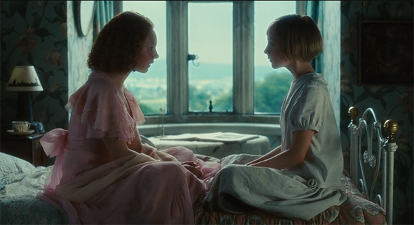
In overcast lighting, the light is white and comes from the sky so there is no strong contrast between light and shadow. Instead, the elements have dark contact shadows and very soft cast shadows. The true overcast paintings are 2, 3, and 5. In the others, the light comes from the window so it had a direction, but they use similar tools so I decided to include them as well.
2. The warm grey of the background
All of the images use a coloured grey for the environment around the figures. It has subtle variations that range from a warm brown to a light blue but it remains quite desaturated.
The paintings 1 and 4 are the only ones to use a bit more saturation for the floor which makes it pop against the desaturated wall, bringing it forward and therefore creating a sense of depth.
3. The saturated accents of colour
Because of the neutral light and background, the saturated colours are really brought forward. The pinks and blues of the clothes in paintings 3 and 4 attract the attention of the viewer straight away. The figures appear to have the same hues than the background, but more saturated. It separates the foreground from the background very effectively and attracts the eye.
In 5, the red of the hat helps to bring the foreground character forward.
4. The use of opposites
In all of these images there is a play of warm against cold, and cold against warm. For example in the 1st painting we can group most of the figures as cold, and we can we can group the floor and the windows as warm. The contrast creates a better readibility of the image and makes it more interesting. On a smaller scale, some the figures have warm accents (usually the face) against cold (their clothes) and the windows use some colds (in the curtains for example) to bring out the warms.
There is also a play of black against white and white against black. Instead of using shadows and lit areas, the painters very skillfully arranged the clothes of the figures so they alternatively wear black and white which contrast against each other and create a sense of depth in the frame. It is interesting to note that the pure whites and blacks are only used in the foreground elements to make them detach from the grey background.
5. The direction of the gazes
All of the images use different compositions but one thing they have in common is that they use the direction of the gazes of the figures to lead our eye in a specific direction: from one character to the other, or from the characters to the focus of the image (the posters on the wall in painting 2). It helps the eye circulate around the paintings.
The effect created
For me, these paintings have a very quiet atmosphere. If there is movement, it is a slow one. It is very soft, unlike a strong and dramatic chiaroscuro. I think they are very effective in the quiet mood they create. It feels like they do not capture a second but rather an instant that will stretch for a few hours. They invite us to pause and look, to sit down and listen. It fits the subject matter really well, especially in painting 3 where we feel as fascinated by the story being told, as the children themselves.